Search Website
Featured Cards
Homepage Full width Left Navigation News Article
The featured card component is a structured element designed to serve as a link hub emphasizing three crucial ideas or call to actions. The component requires a set of three cards with an image and title for each.
For technical support or detailed instructions on building your new site, visit the Cascade CMS template design documentation.
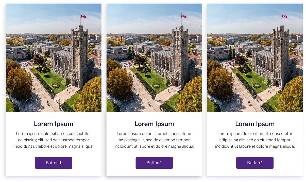
Image Guidelines:
- Dimensions: 1200 × 800 pixels
- Image crop: position subjects in the centre of the image, to ensure the focal point of the image is visible when scaled to different screen sizes