Search Website
Cards
Homepage Full width Left Navigation News Article
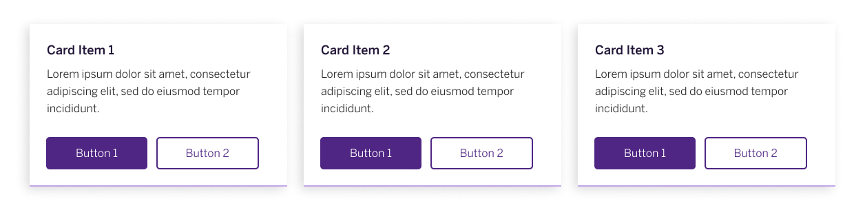
A card component displays concise, organized content in an appealing, easily digestible format. Content within each card is managed through the WYSIWYG editor, offering full flexibility and the option to add two CTA buttons.
When using cards, editors should be aware that they are displayed in columns of three on desktop. If fewer than three cards are added, an empty space will remain. If there are more than three cards, the additional ones will automatically move to the next row.
Each card includes two buttons, and the height of each card adjusts to match the longest content, ensuring that all cards and buttons remain aligned. Content for each card is managed through a WYSIWYG editor, offering full flexibility to structure it as needed. Editors can include elements such as images, videos, headings, links, bulleted lists, and buttons.
For technical support or detailed instructions on building your new site, visit the Cascade CMS template design documentation.