Banner Design Guide
When creating banners please keep in mind the final shape of the banners themselves. The overall homepage banner size has increased to 1920*600 pixels which creates a landscape layout. Often standard, portrait headshots don’t work with a horizontal image layout. Therefore, please take into account when either taking your photos or making homepage banners the horizontal layout.
When adding text labels to your images (either in the image or via the Cascade platform) limit your headlines to two lines maximum and your subheads to one line.
Getting Started
Consider the photo you are taking and how it will fit into the banner boundaries. A portrait photo will not fill the space and will leave a wide gap on either side of the image.
In the below examples this format worked well because the background was either black or a simple enough colour that it was easy to copy and “extend” the photo using Photoshop.

Ideal Options
An option is to avoid using headshots altogether and instead use a striking image that is large and fits your theme and invites clickthrough, like so:
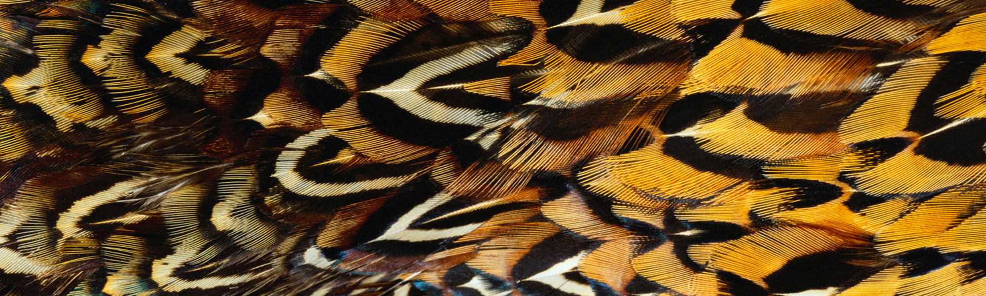
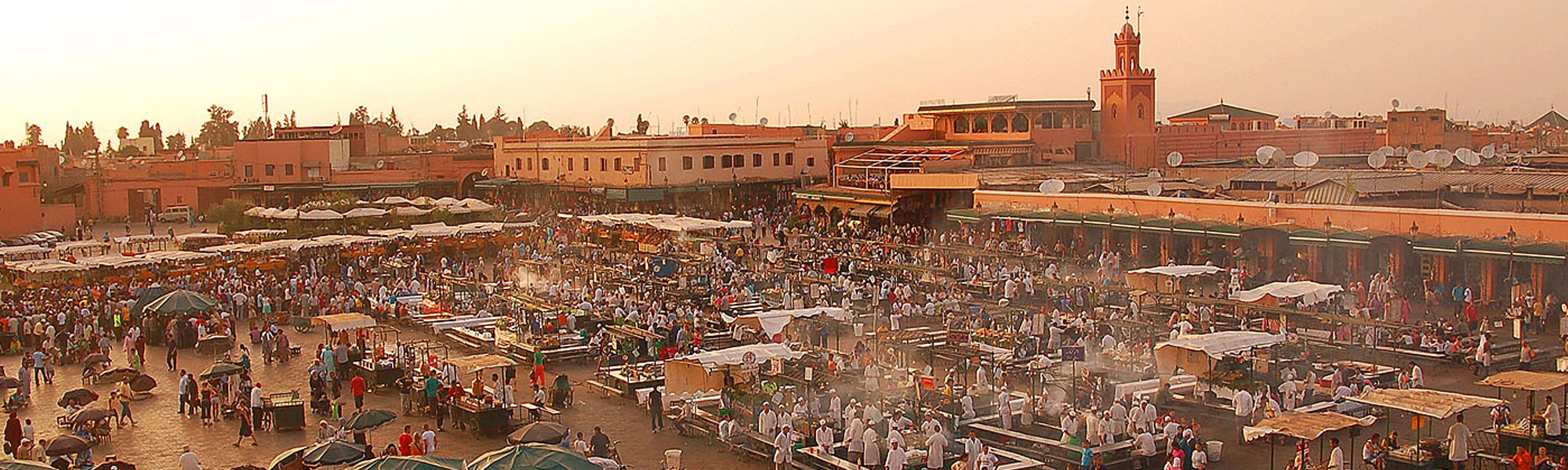

Photos like these are ideal, they are large, artistic, compelling and striking. Images like these may be difficult to obtain so further planning when creating communications pieces may be required.
Most of the above images were the result of a Google image search which means they cannot be used on real banners as someone else owns the copyright. The green model one is a Western photo and the Jupiter one is from NASA so both of those we have access to.
Text Labels and Guidelines
The Cascade template redesign adds the feature that lets you place text over your image, removing the need to embed text into your banners as you create them. In the following images the black text box is transparent, allowing the photo to peek through the box while ensuring that the white text still stands out. The text can be placed on the left and right of the banner and there is also an option to place the text in the centre of the image.
Using these text labels instead of putting text directly on the image itself ensures that it is more accessible as it can be resized, translated, and interpreted by screen readers. This functionality improves our ability to provide users with content and helps Western meet our AODA requirements.
Left-aligned:

Centre-aligned:

Right-aligned: